JULIAN
Cocktail lab

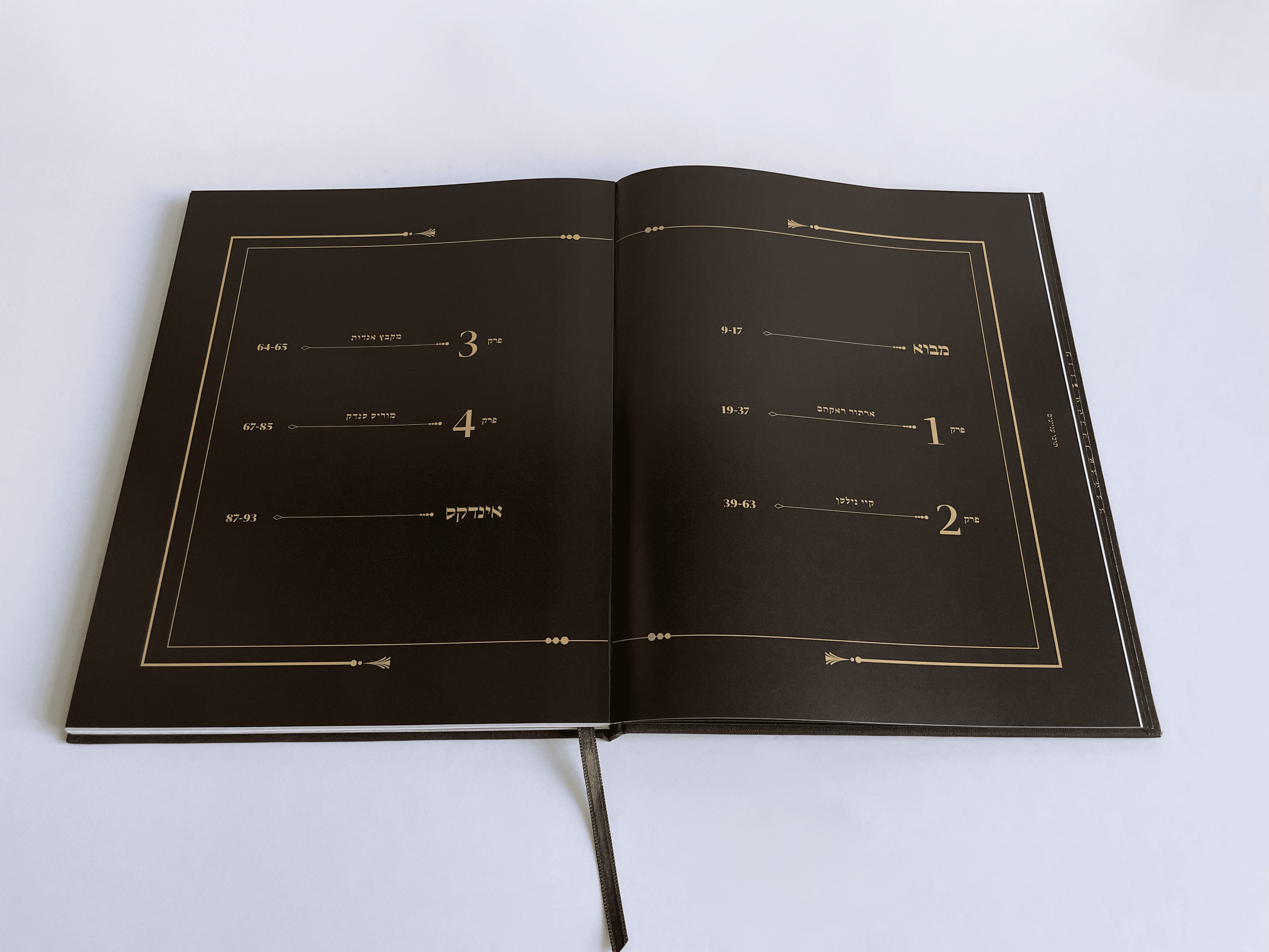
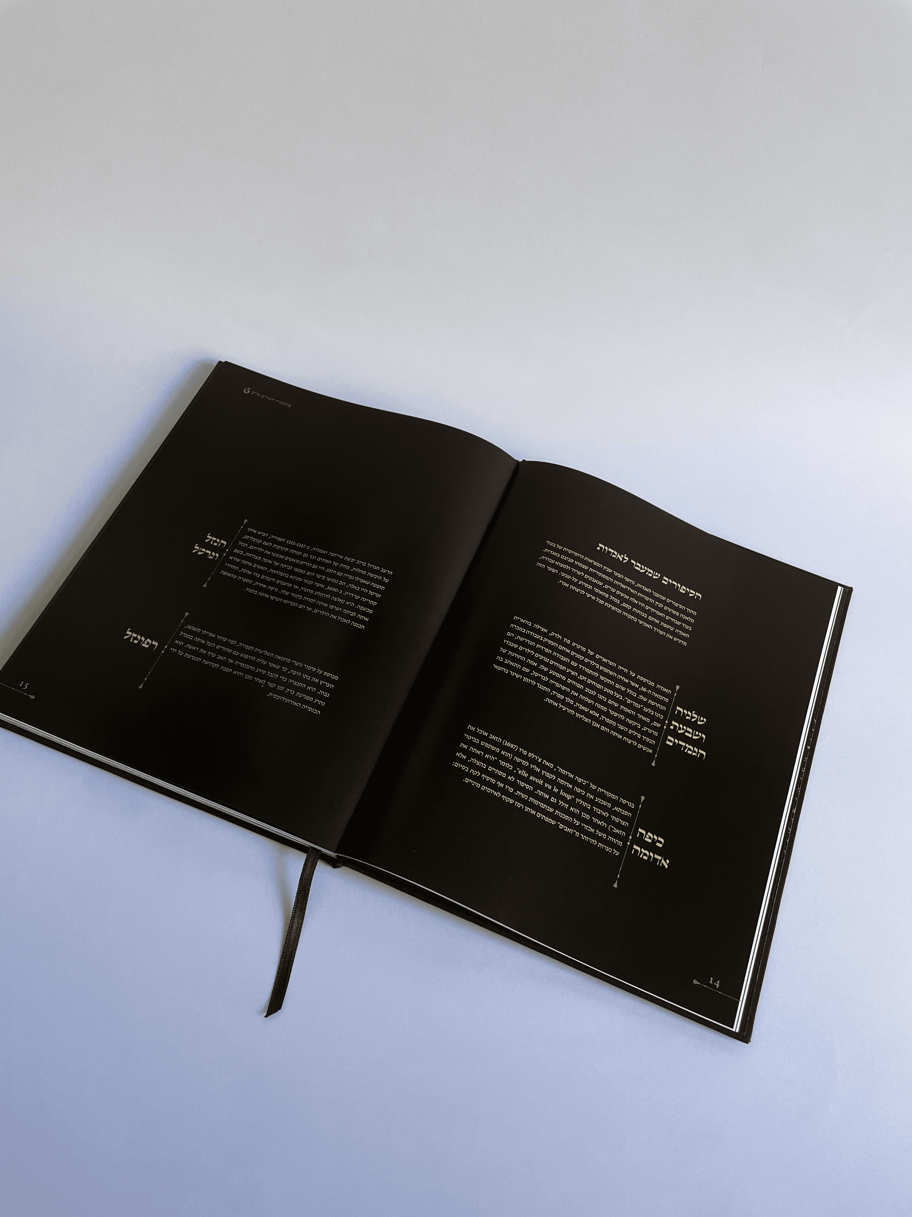


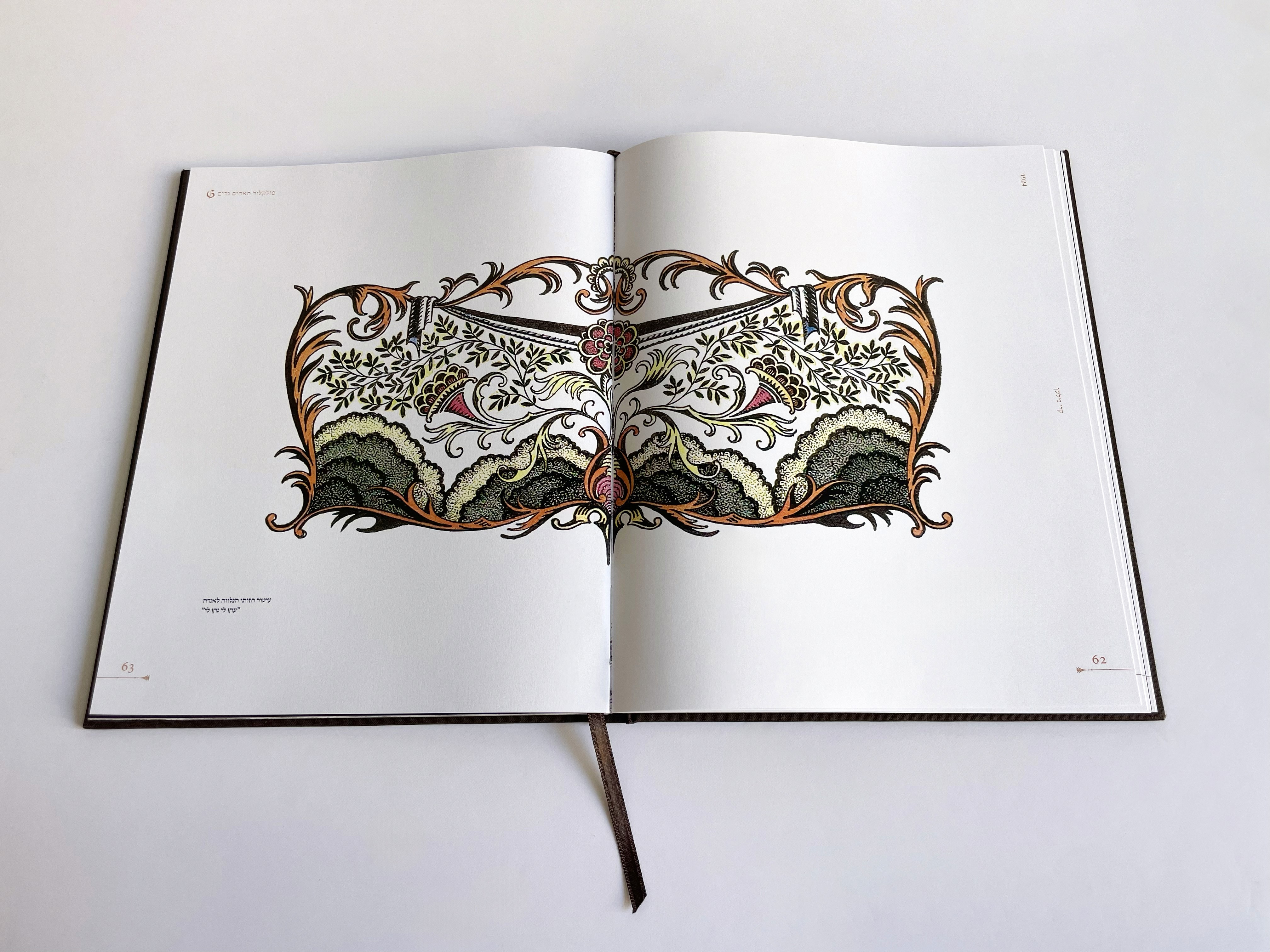
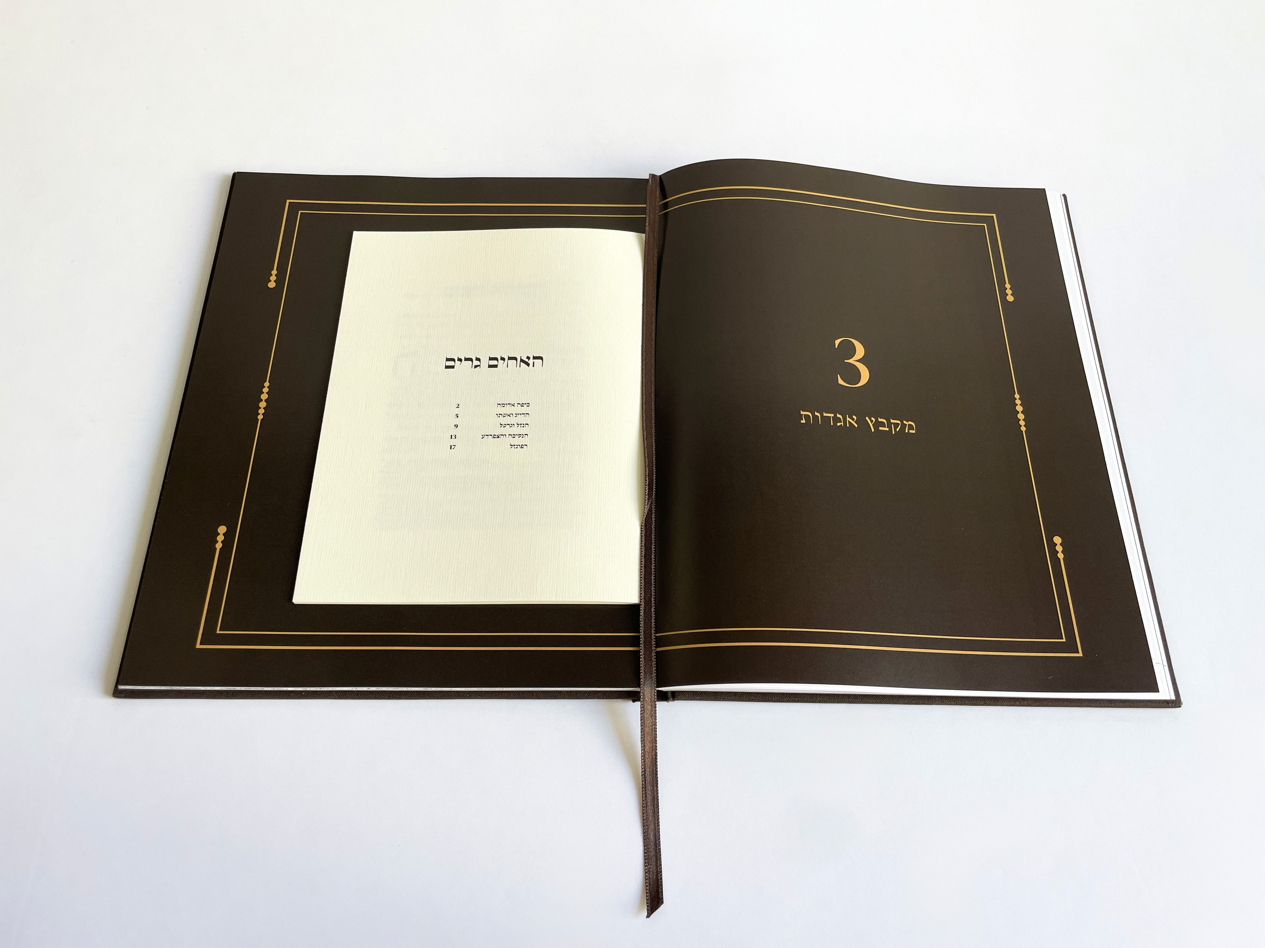
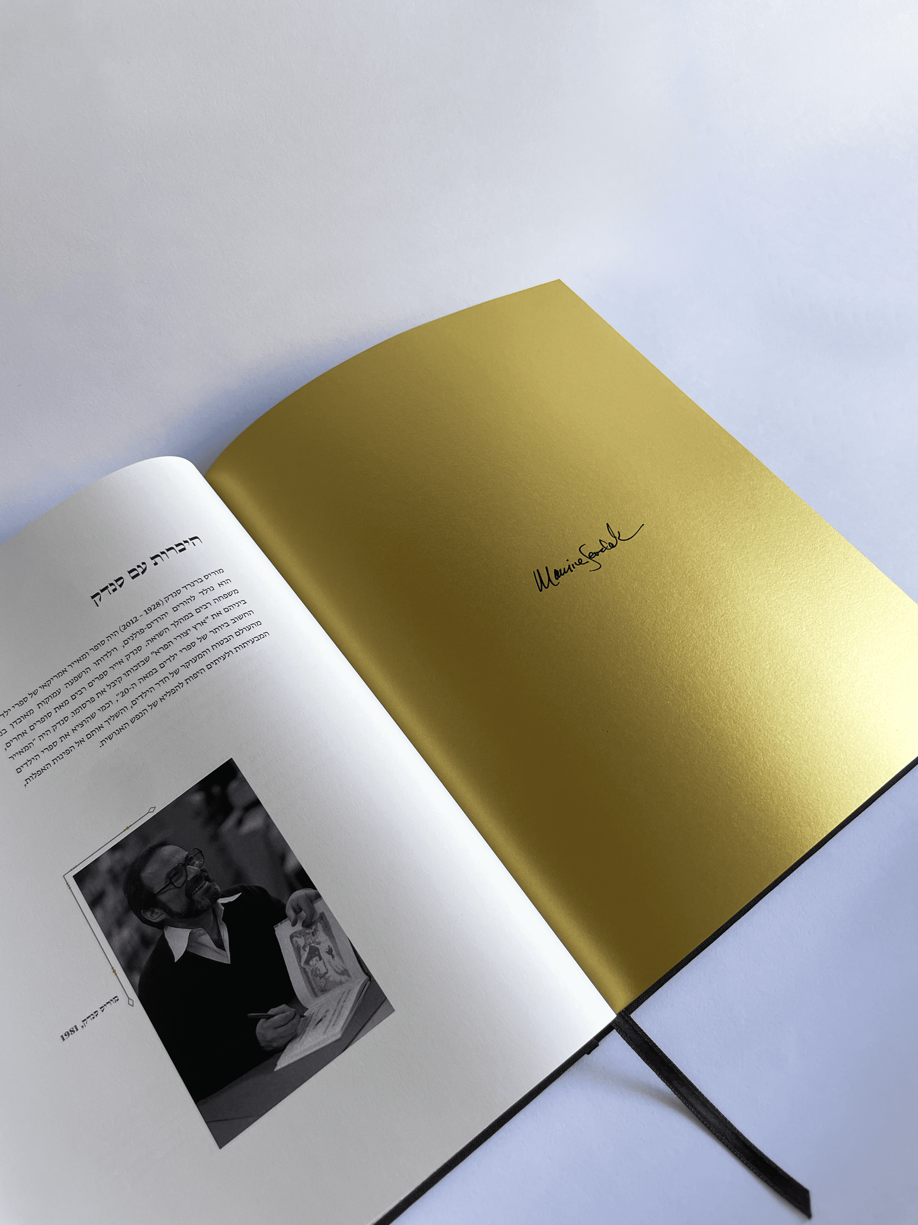


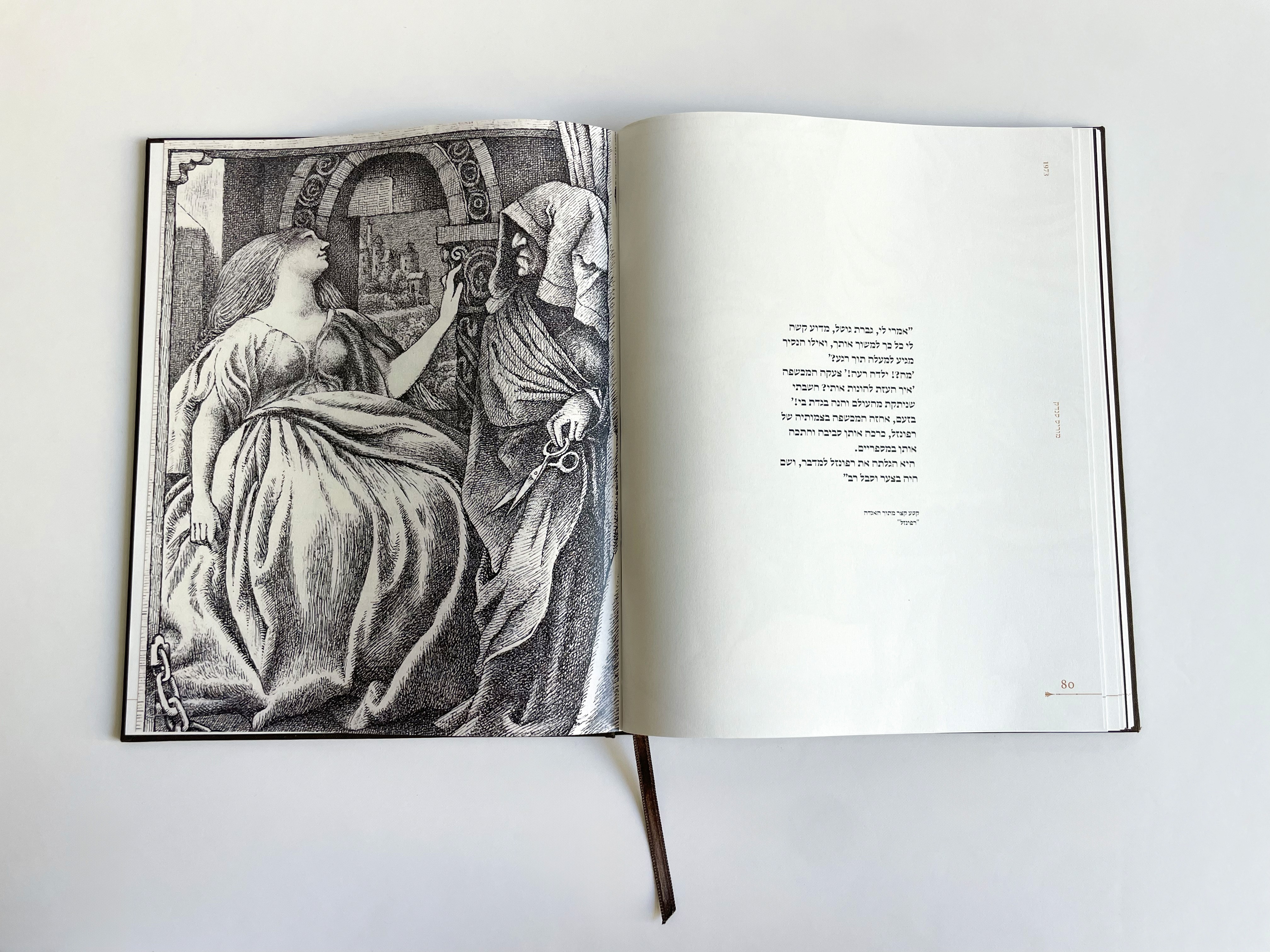


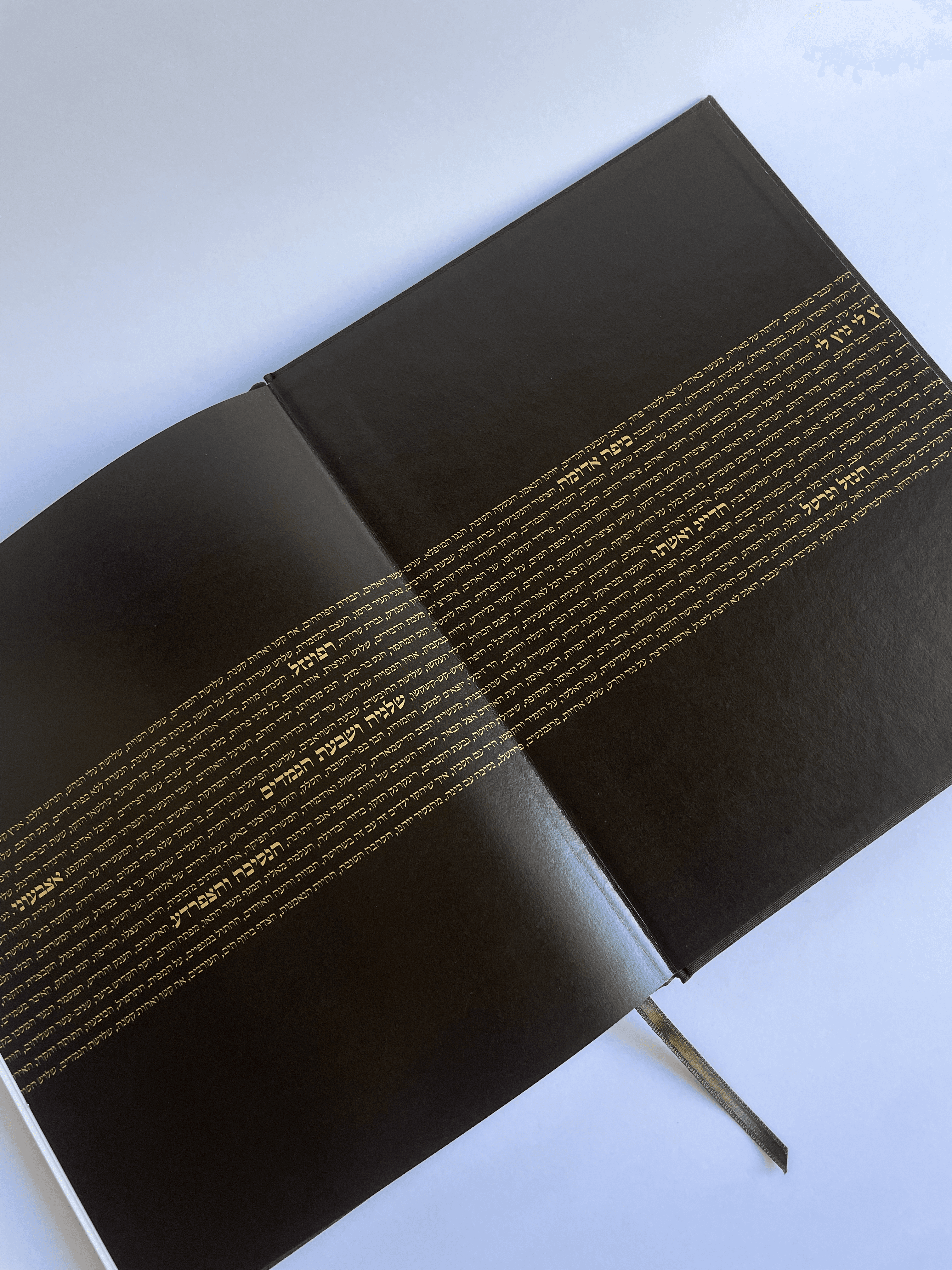
The original fairy tales of the Brothers Grimm, published in the 19th century, are quite different from the popular children's versions known today.
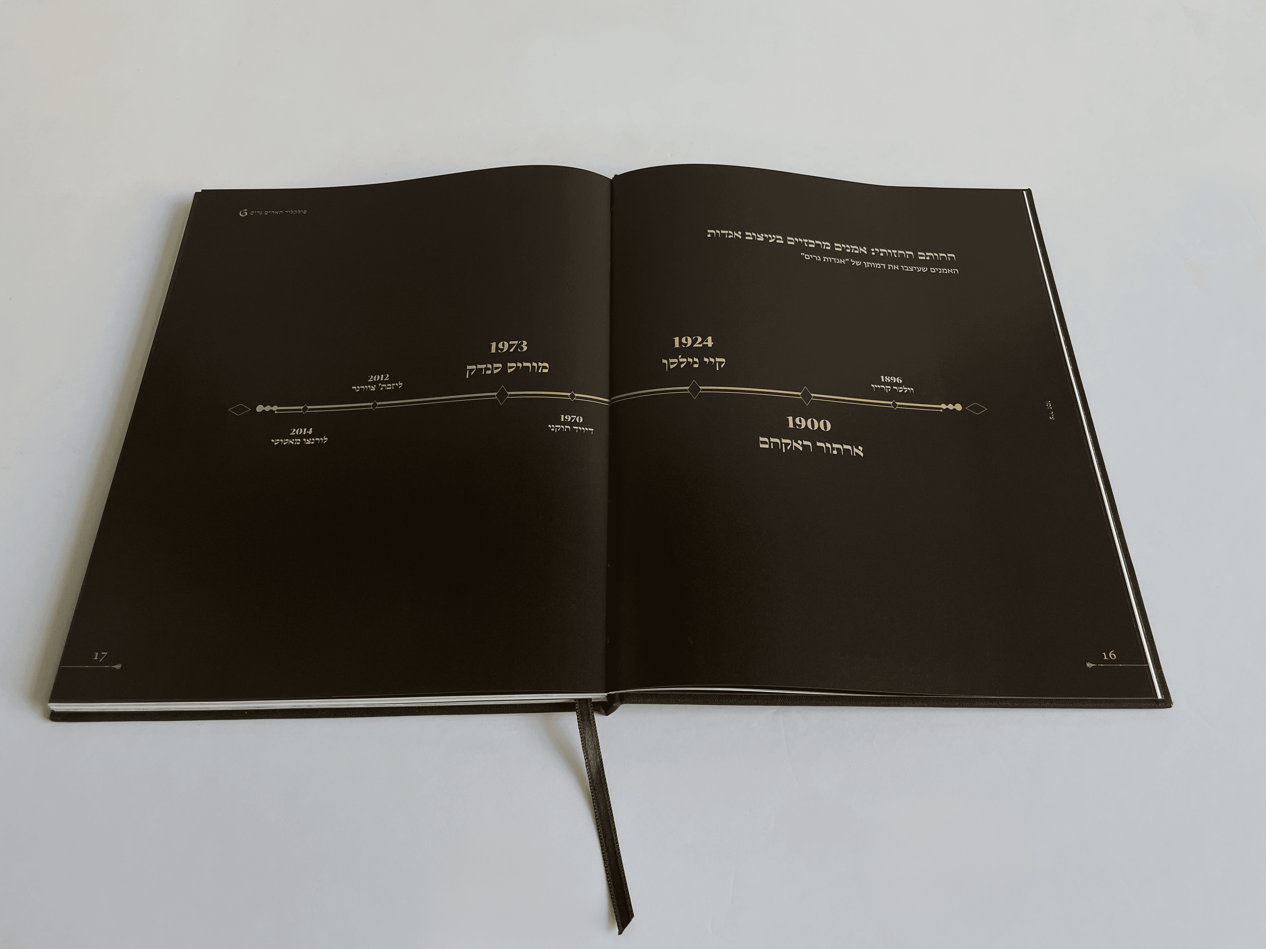
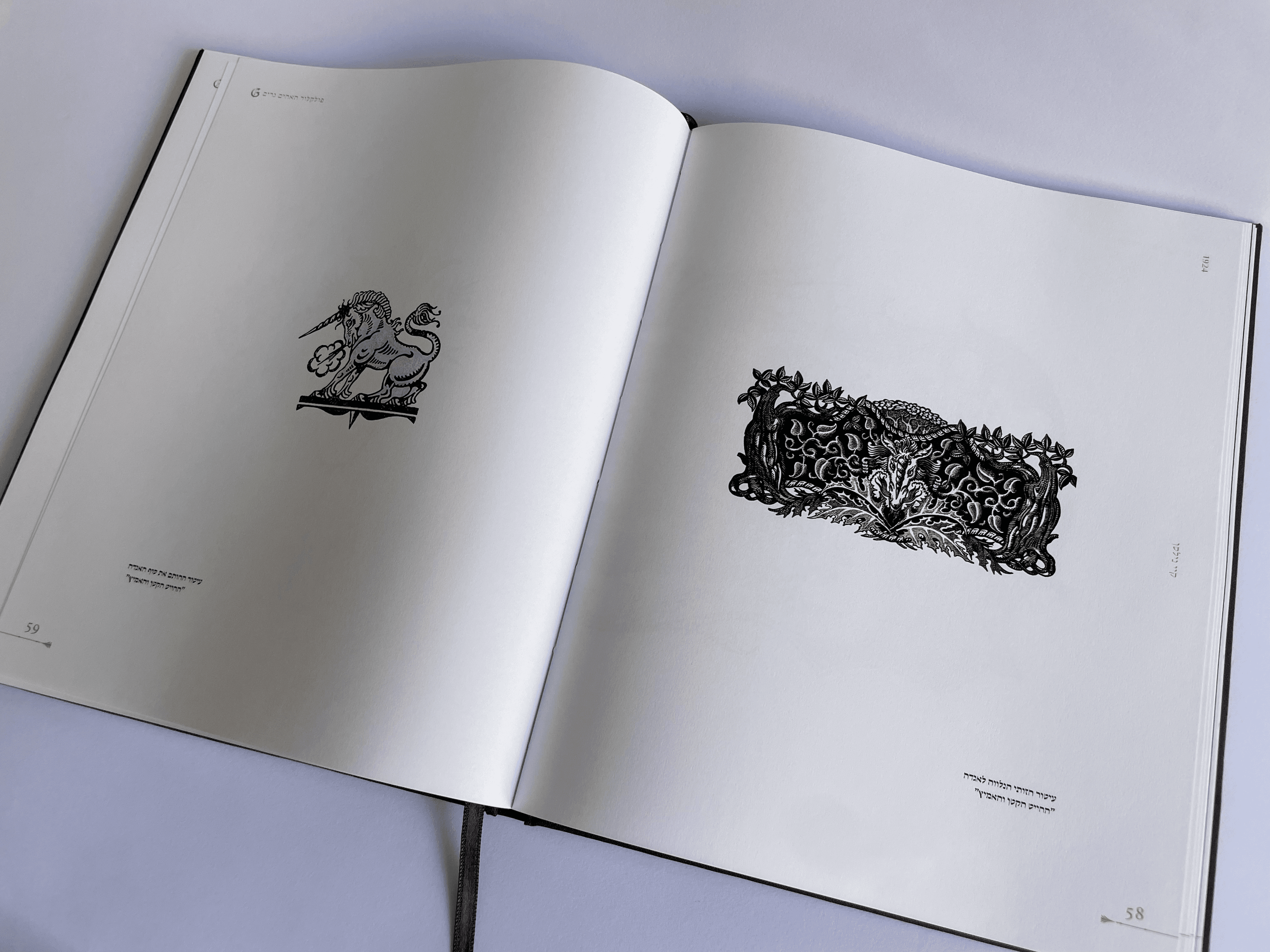
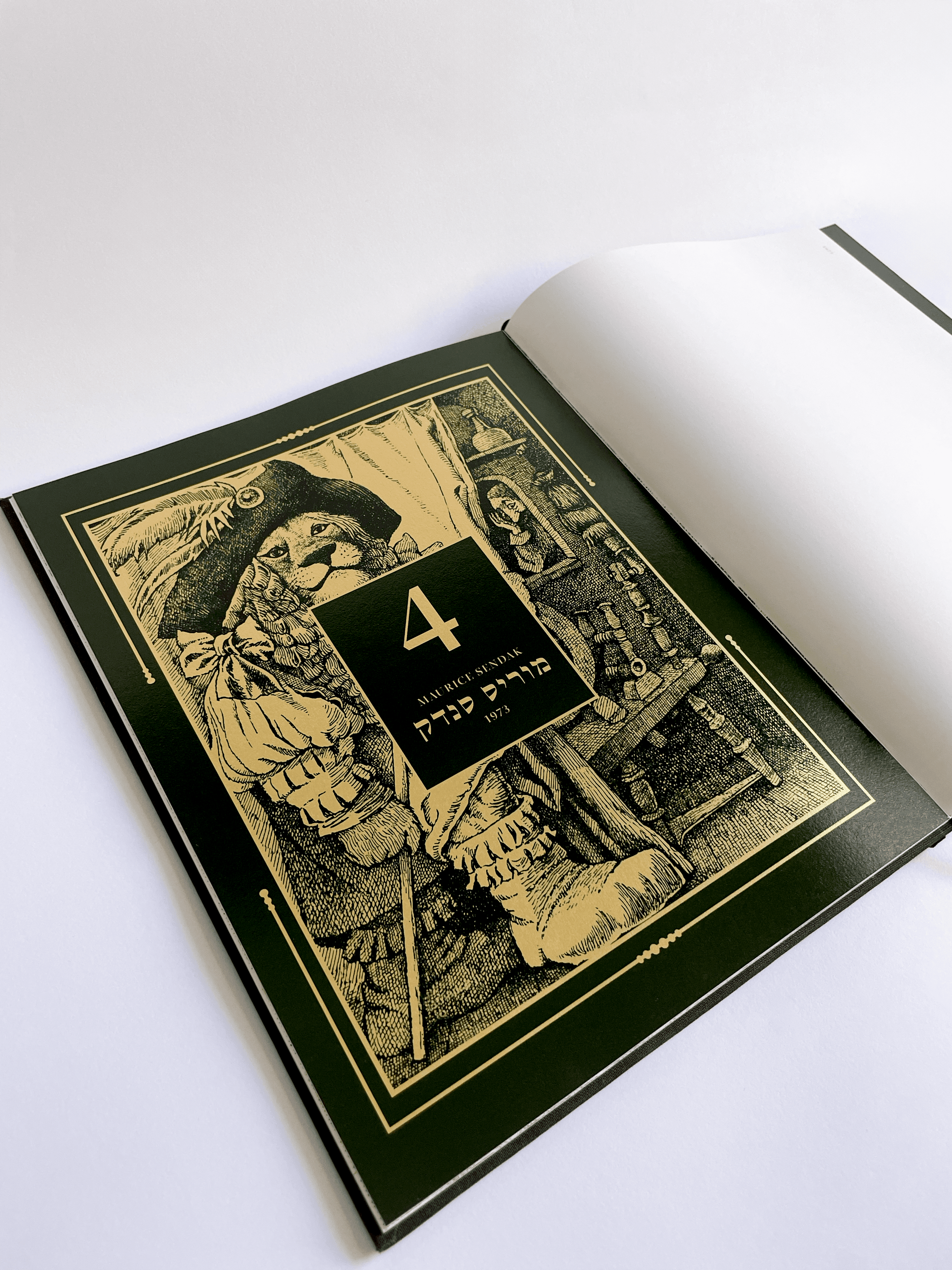
The catalog presents the works of three prominent illustrators who have shed new light on the Brothers Grimm's tales: Arthur Rackham, Kay Nielsen, and Maurice Sendak.
Each of these illustrators brings a unique approach to illustrating the Brothers Grimm stories, thereby creating a visual world that conveys a distinct atmosphere and evokes different experiences for the readers.
Font
Decoration

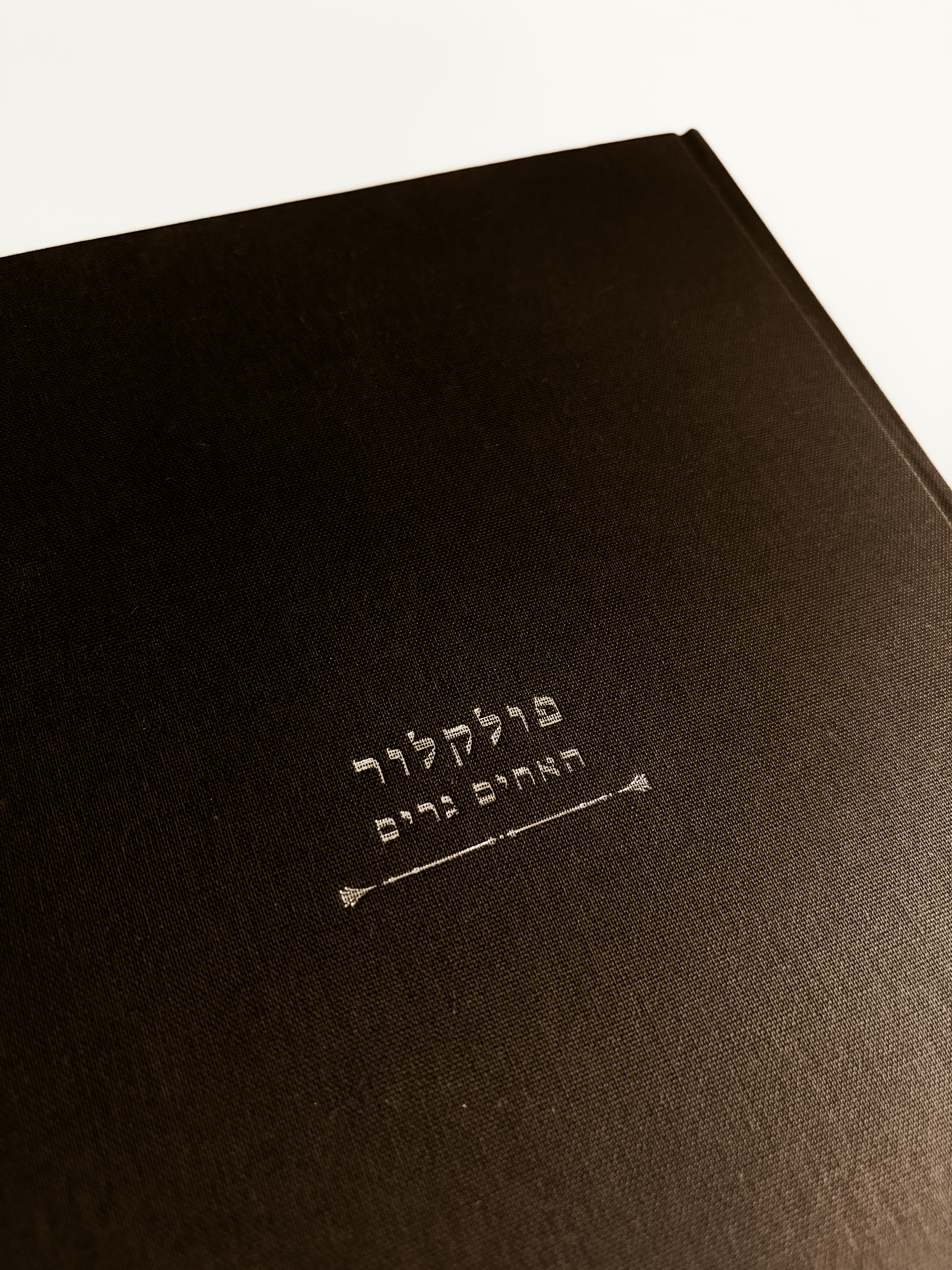
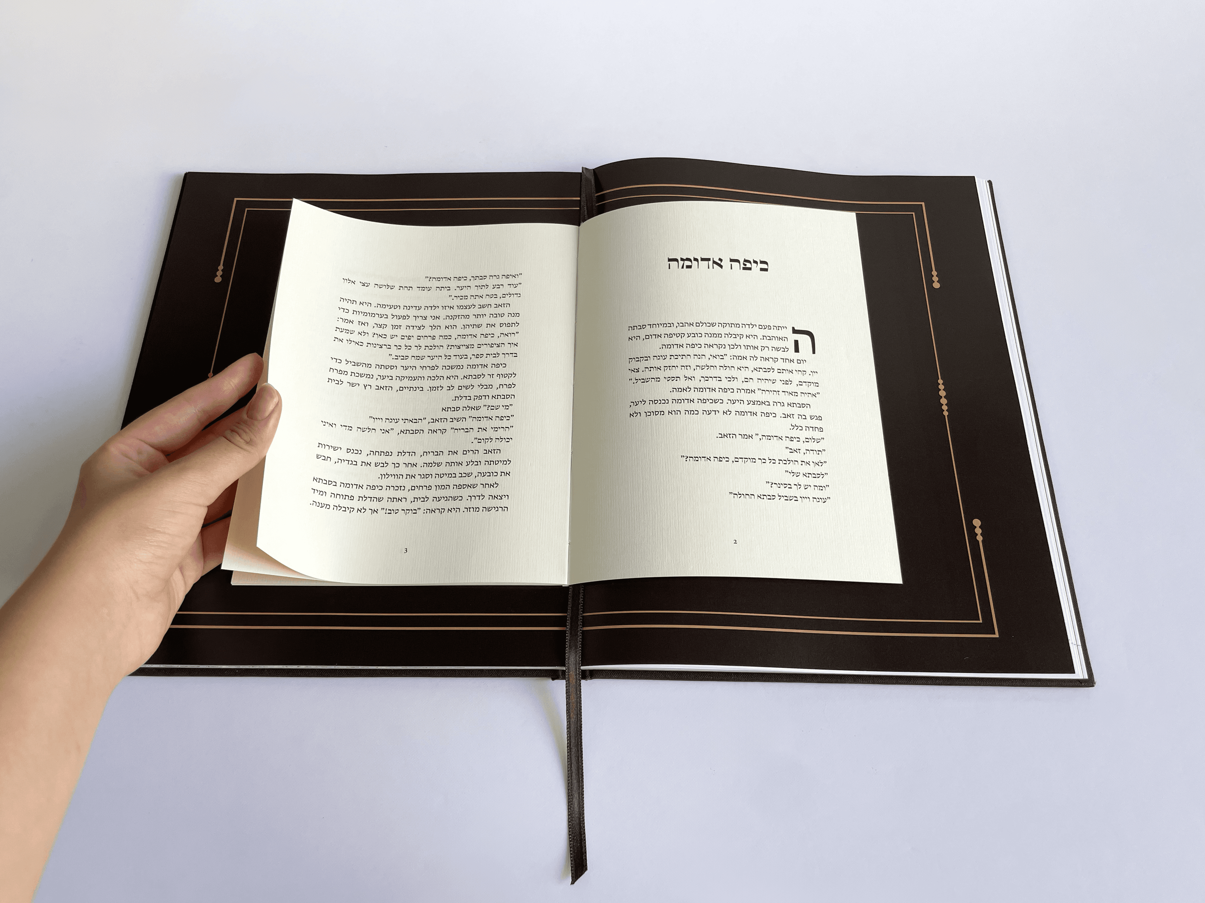
I chose the 'Greta' typeface from HaGilda. It's a serif, elegant font
that fits perfectly with a fairy-tale aesthetic.
Logo
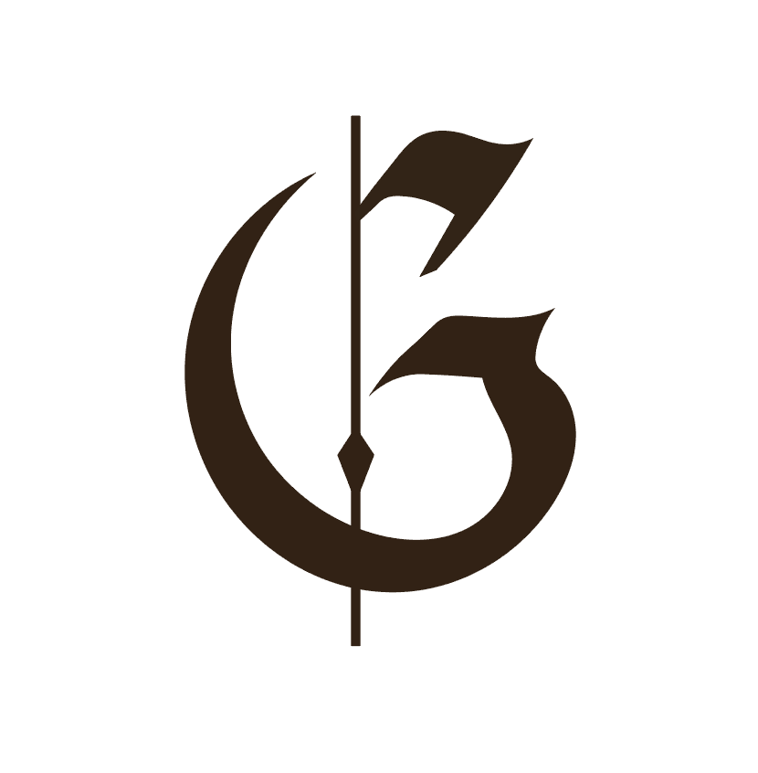
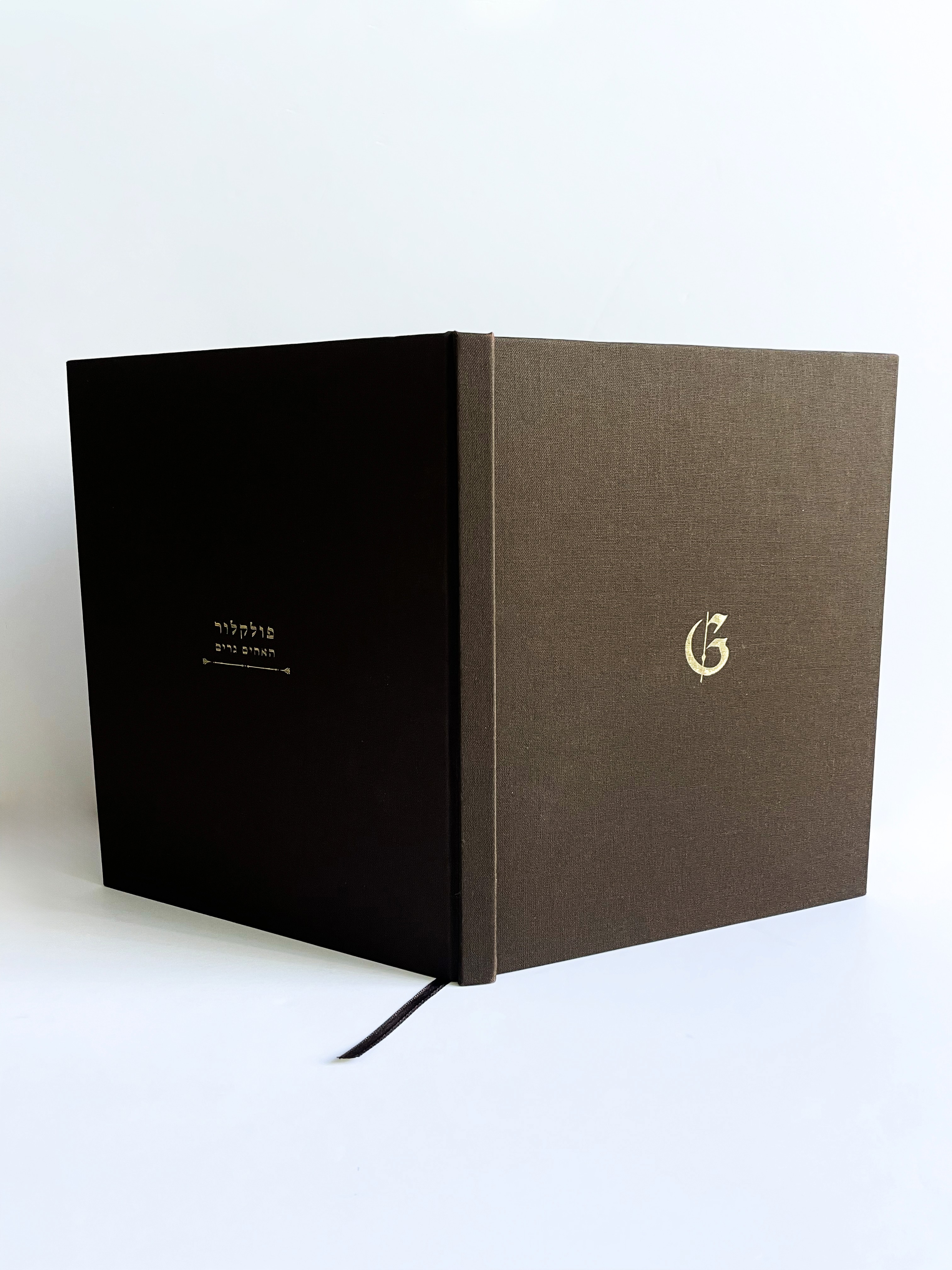
I chose the letter G in the German Fraktur script:
a traditional and dramatic Gothic typeface for the catalog logo.
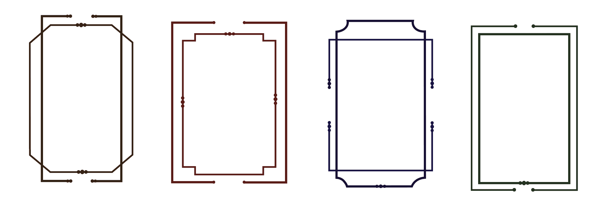
Designed drop cap frames
Ornaments were an inseparable part of the catalog, as expected in the world of fairy tales. I designed them with a geometric aesthetic and a modern twist. it was important for me to offer a contemporary interpretation of these ornaments, which are often perceived as 'heavy' and 'antique,' and to give them a light, fresh, and surprising look.
Designed frames
Footnote ornaments and Page numbering
I had so much fun!
Bye!!!
Folklore Grimm Brothers
Client | Studential project
Design field| Catalog Design
Tool| InDesign
Year| 2025